Clean & Pristine Car Care
A cluttered, popup-heavy site rebuilt into a clean, booking-first experience that loads fast and reads clearly on a phone.
What was holding the old site back
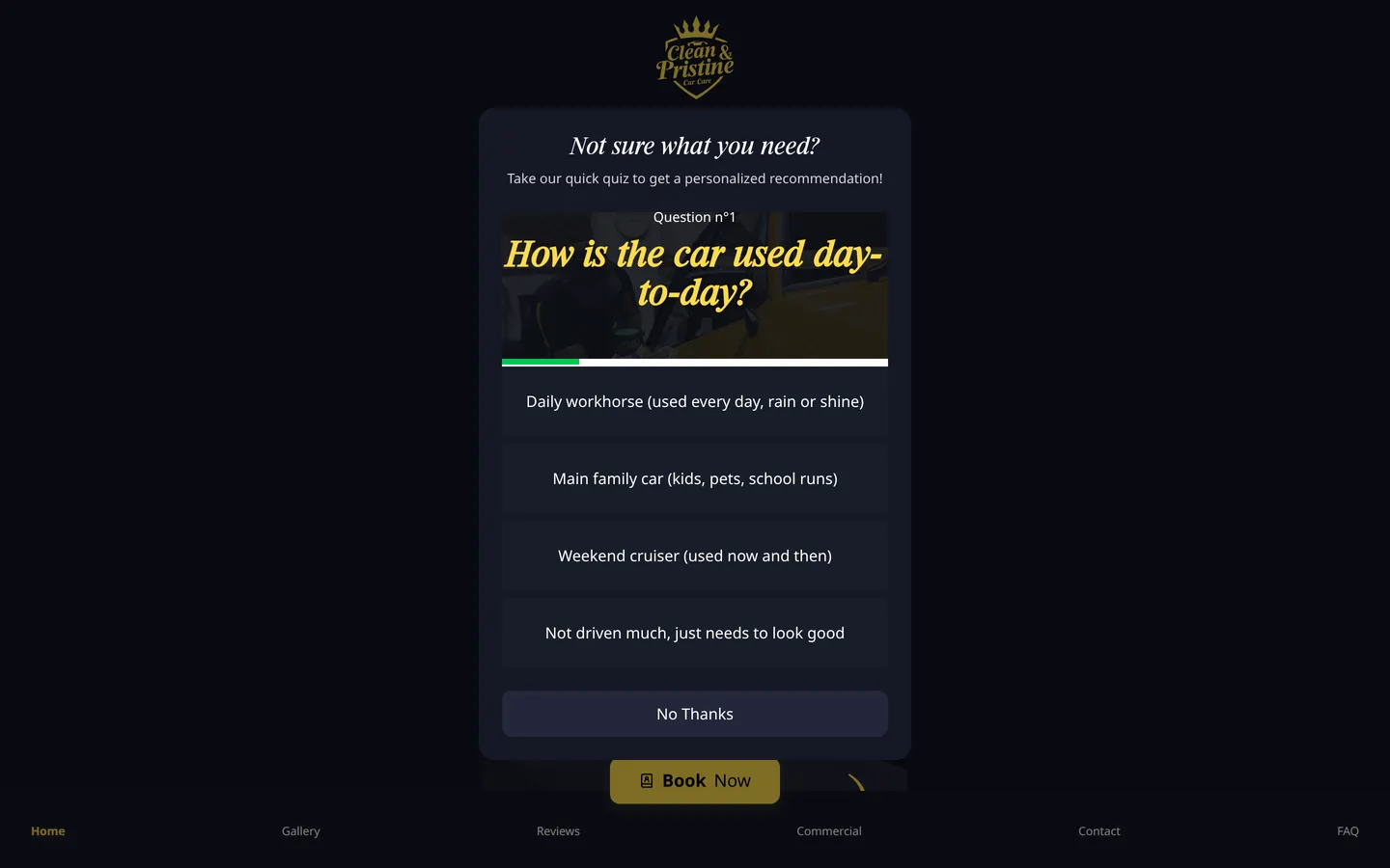
The homepage greeted every visitor with a quiz popup that covered the hero before they could see what the business did.
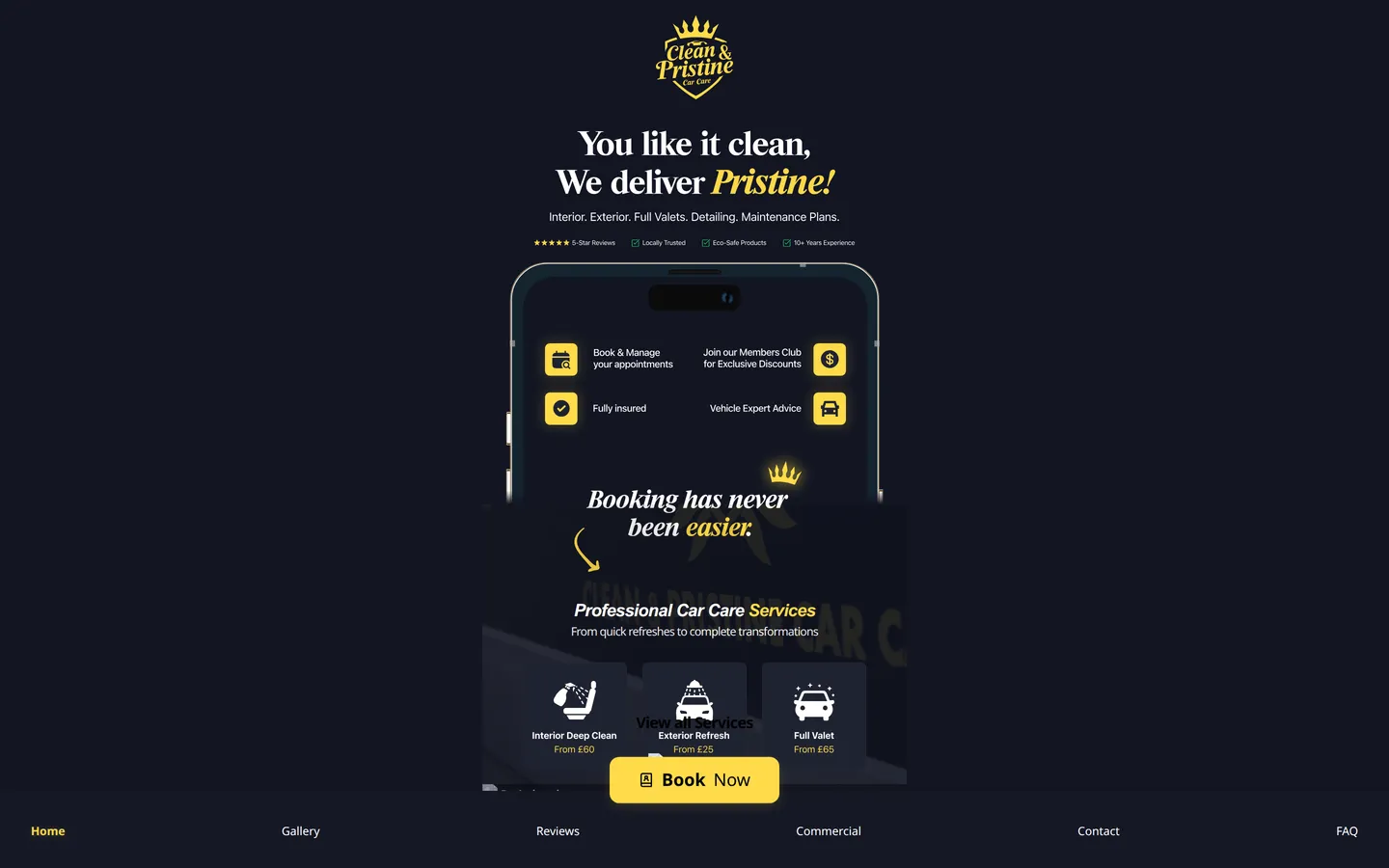
Layout elements collided - text overlapping the phone mockup and service cards - and the navigation was stranded at the bottom of the page.
Search basics were misconfigured: the canonical URL and social tags pointed at the wrong domain, the Google verification tag was an unedited placeholder, and there was no sitemap.
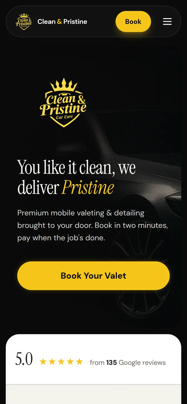
Before and after
What we changed
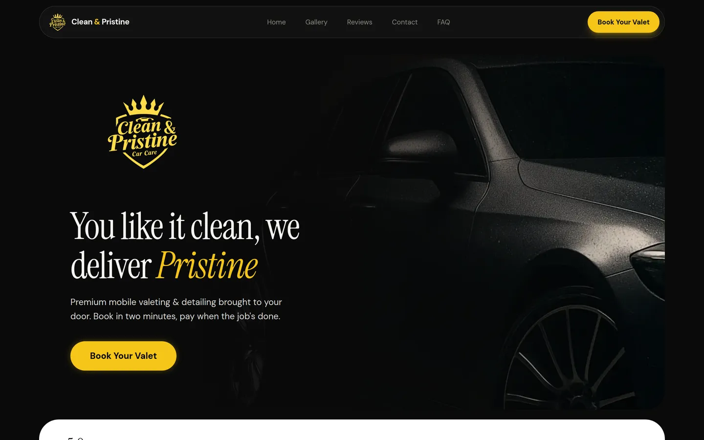
- Replaced the on-load popup with a clear hero and a single, obvious booking action.
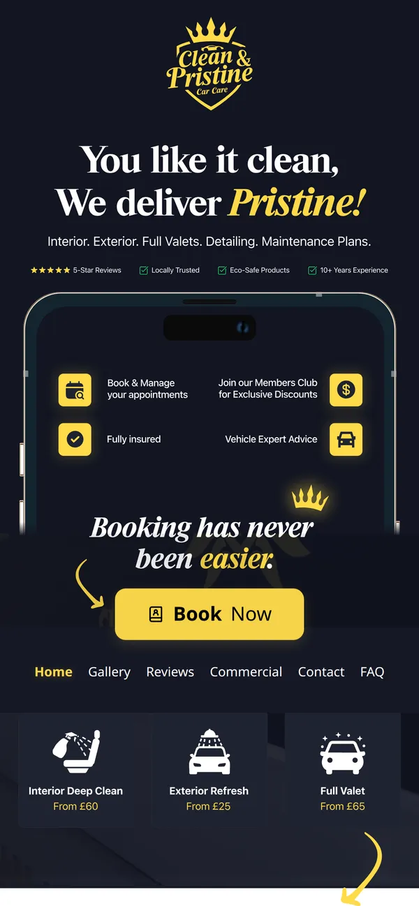
- Rebuilt the layout into a clean, responsive grid that holds together on a phone.
- Corrected the canonical URL and social tags to the real domain.
- Added a sitemap so search engines can find every page.
- Configured email authentication (SPF, DKIM and DMARC) so the domain's email is trusted.
By our own audit, the site went from 71/100 to 95/100 - down from 19 fixable issues to 2.
The two remaining flags are deliberate calls, not loose ends:
- Email enforcement is staged on purpose. We set up full email authentication (SPF, DKIM and DMARC) and put DMARC into its standard monitoring mode first. Tightening it to strict enforcement is a deliberate next step, taken only once every legitimate mail source is verified - so the business never risks its own booking emails being held back as spam.
- One contrast flag, left to keep the brand intact. A single, marginal element trips a strict colour-contrast check. Matching it perfectly would mean overriding the client's chosen brand colours, so we kept the brand as-is. That's a call we make with the client, not a technical limit.
Want this for your site?
Start with a free audit - the same checks we ran here, on your site, in about 60 seconds.
Get your free audit →